Topic: Black and White (99 posts) Page 18 of 20

Nebraska

The Oscars were a couple of weekends ago and, although I didn't see the show, I did read the list of winners and the film Nebraska got none.

The awards had the characteristic ring of "business as usual" where the industry heavy hitters garnered praise and the most small independent films did not. Nebraska is, without a doubt, a small film. But it holds so much for us as artists and photographers that I would place it as the best film I saw all year by a large margin. Were I a voting member of the academy, I would be livid.

First of all, the film is in black and white. But what amazing black and white it is! Shooting in very high contrast with an Arri Digital Camera, there is dynamic range as I've never seen before. Shadows are detailed and highlights bright but not blown out. The several low light scenes have almost no noise and look as seamless as the outdoor scenes. Sometimes self awareness can get in the way in a movie or in photography, but I felt as though the film makers were speaking directly to me through their use of selective focus, focus shifts, framing, placement and clearly being aware of the whole image from corner to corner in each frame. Some films deny the camera and its use. I felt Nebraska was reveling in the camera, the optics and the incredible quality it produced. I believe the quality of the cinematography raises the bar on black and white films made in the future and perhaps all films.

The film starts out in Billings, Montana with Bruce Dern's character walking along the highway to Nebraska to cash in a sweepstake ticket, thinking he's won a million dollars. I know Billings a little, and made a series of pictures there in 2005: Billings. I also wrote a blog about the series here. The Billings geography is distinguished by a large rock escarpment hovering above much of the residential area of the town. This is also prominent in "Nebraska". Much of the movie is a road trip, two characters played by Dern and the actor Will Forte as his son as they drive along the relentlessly flat and sunlit landscape of the American midwest in what looks like late summer or early fall. There is sky, which is always big, and ground, which is usually bright and almost irridescant, reminding me of how black and white infrared film renders similar content. 

The director of the movie was Alexander Payne, who has to his credits films such as The Descedents, Sideways and About Schmidt. Payne was born in Omaha, Nebraska and is of Greek descent. Phedon Papamichael was the cinematographer. He has worked with Payne in numerous films and is also of Greek descent. Clearly these two are a team with excellent results. 

My brother-in-law is Thomas L.Turman, a retired architect and architecture teacher living in Berkeley, California. He is also an excellent artist and writer. After seeing Nebraska he wrote a poem. Tom grew up in the midwest and felt a strong affinity for what the film showed of the area. Here it is:

Montana

I know you Montana
   and your sisters Dakota.
Your savagely weathered land
   grasping scarecrow stunned farmers.

Land that demands much,
  and gives little,
You lie in wait with your threat
  of never ending hard work.

I have seen your towns
   along ribbon straight roads.
Clutching the dry farmer dirt
   like flattened loosing wrestlers.

Time worn wood buildings
   huddled against 
history.
Leaning against one another
  along empty windblown streets.

People, hats down against the wind,
   pass neighbors with name 
salutes.
"Everett." "Silas." Lost in the wind.
  There is always next week.

Your fierce, hard horizon
   is a soul clenching admission.
This is all there is,
  and all that ever will be.


Topics: Commentary,American Beauty,Blade Runner,Black and White

Permalink | Posted March 12, 2014

Nantucket 1980 Part 4

This post continues and finishes a discussion about the original Nantucket pictures I made in 1980. The other posts, Nantucket 1, 2, and 3 proceed this one, if you haven't read them yet.

In Part 4 we'll take a look at the ending to the Nantucket series and I'll let you in on a little secret.

We left off in Part 3 with a picture that changed things structurally within the series. Let's see where the 11th picture in the set takes us:

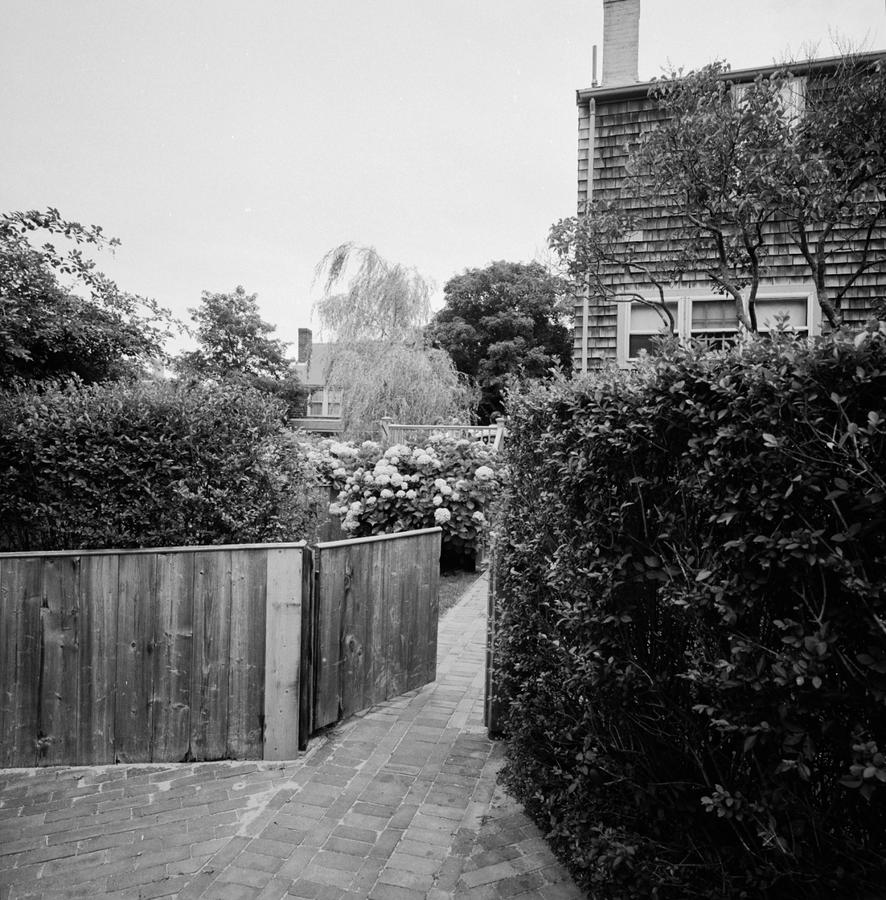
Here, we're back to the previous structure with the fence sitting in the foreground. The only thing different and perhaps anomalous with this one is that, while the gate is open as we've seen in others before it, we aren't shown where it leads. To be honest, this is my least favorite picture in the series and were I to do this over I probably wouldn't include it. However, it does serve as an effective hinge to the next one:

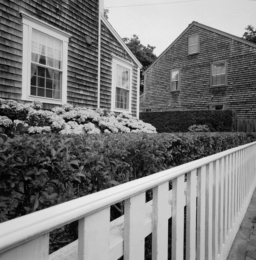
which is mostly about geometry, in which I did poorly in school. Maybe this redeems that a little. Triangles and geometric shapes everywhere, even in the sky if you look at the two spaces cut by the roofs. This was fun to make and is still enjoyable to look at.

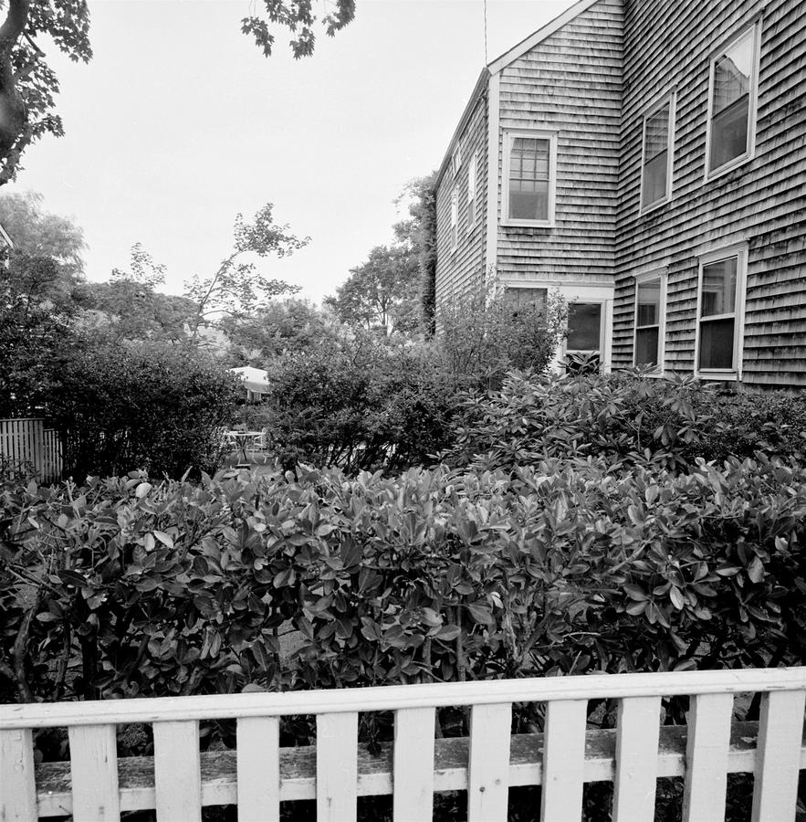
Here, we're back into barriers and yet with a make up that is far more open than in earlier pictures in the group. Point down with a wide lens and verticals will bow out as you can see on the side of the house on the right. This makes the picture look a little like being made from inside a fishbowl.

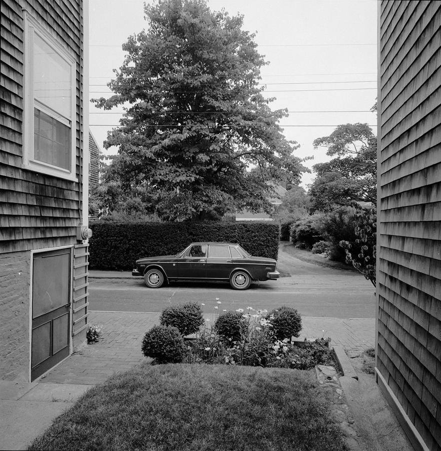
This one's another structure changer, stopping the alley I've set up with a street and a Volvo sitting squarely in the way, almost impeding progress completely. The only way out is the driveway to the right, that really isn't very promising as it looks to stop you behind the bush. I often get questions in lectures as to why I include cars in my pictures. Because they provide scale. We all know how large a car is.

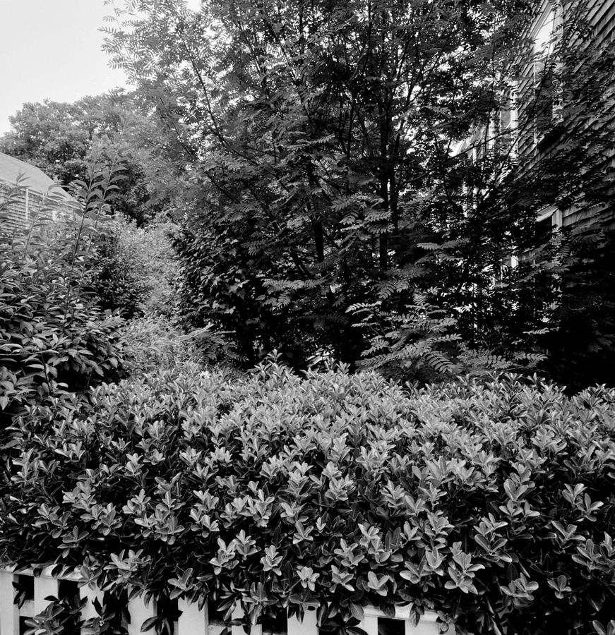
Here we are, closing the series out with a picture that is practically fully closed in, that almost obscures everything. Is this some sort of statement about mankind and how, when we are gone, the natural world will reclaim its prominence?  

Or is it about disallowing the structure that constrained the previous pictures and defined them as well? 

Or does this picture refute the ones that came before it? 

Why won't I say what this is, this picture? Because it isn't for me to tell you what it is is, it is for you to tell to decide.

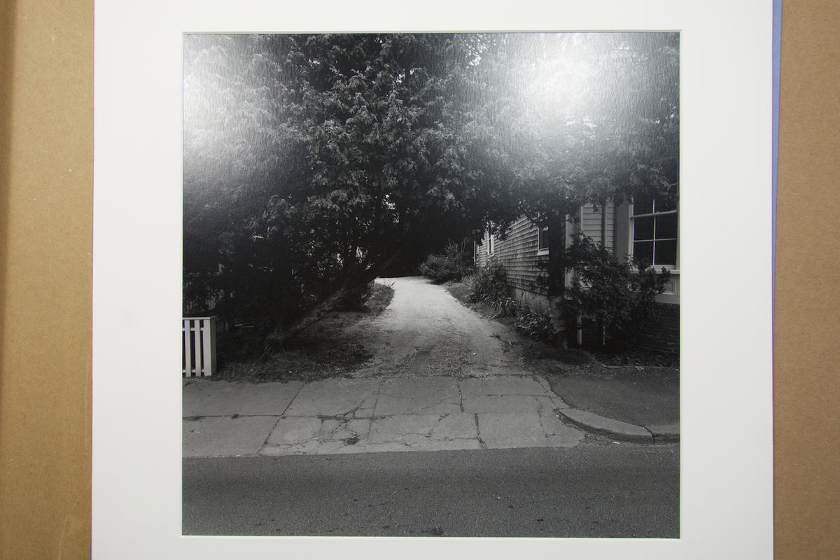
Finally, and in the nature of full disclosure, in the printed series the last picture is this, here poorly reproduced as I have no scan of the negative:

(The two light areas are reflections from the bulbs used to make the slide, not in the print)

The print shows us a street, dark foliage above a driveway pulling back and getting lighter as it reaches the background, indicating some open sky back there. A dark foreboding image but with perhaps a ray of hope? That was my intention.

Over the years, as the series has been shown from time to time I have included this last image probably more times than not, although when I made the Nantucket pictures the last in the series was the one before this one, the one with the growth taking over. Why? I can't exactly say, except that one seemed more dire than the other. 

When I printed the series for the first time I was very excited, as I'd made pictures in a fundamentally new way for me and felt I'd made a breakthrough. In showing them to a close colleague at Harvard, she said that they were very depressing. I liked that as she got their weight and maybe their depth. But to end with a picture that didn't allow you out, to not permit escape from these pictures' weight seemed too much at times so I would include the last one with the driveway to indicate at least a possibility of a positive outcome. I always thought of this series as having different endings as in a film where the director has shot different endings for different audiences or markets. The movie Blade Runner was like that. The director, Ridley Scott, shot different versions of the ending.

This finishes my look at the first series I made. I hope you have enjoyed it. As  always, you may contribute to the conversation by emailing me:

Neal's Email

Topics: Black and White,Series,Analog,Northeast

Permalink | Posted March 5, 2014

Fred Sommer

I wonder how many of you know the work of Fred Sommer.

If you don't this will get you started (from Wikepedia):

Frederick Sommer (September 7, 1905 – January 23, 1999), was an artist born in Angri, Italy and raised in Brazil. He earned a M.A. degree in Landscape Architecture (1927) from Cornell University where he met Frances Elisabeth Watson (September 20, 1904 – April 10, 1999) whom he married in 1928; they had no children. The Sommers moved to Tucson,Arizona in 1931 and then Prescott, Arizona in 1935. Sommer became a naturalized citizen of the United States on November 18, 1939.

Considered a master photographer, Sommer first experimented with photography in 1931 after being diagnosed with tuberculosis the year prior. Early works on paper (starting in 1931) include watercolors, and evolve to pen-and-ink or brush plus drawings of visually composed musical score. Concurrent to the works on paper, Sommer started to seriously explore the artistic possibilities of photography in 1938 when he acquired an 8×10 Century Universal Camera, eventually encompassing the genres of still life (chicken parts and assemblage), horizonless landscapes, jarred subjects, cut-paper, cliché-verre negatives and nudes. According to art critic Robert C. Morgan, Sommer's "most extravagant, subtle, majestic, and impressive photographs—comparable in many ways to the views of Yosemite Valley’s El Capitan and Half Dome by Ansel Adams—were Sommer’s seemingly infinite desert landscapes, some of which he referred to as 'constellations.'"[1] The last artistic body of work Sommer produced (1989–1999) was collage based largely on anatomical illustrations.
Frederick Sommer had significant artistic relationships with Edward Weston, Max Ernst, Aaron Siskind, Richard Nickel and others. His archive (of negatives and correspondence) was part of founding the Center for Creative Photography in 1975 along with Ansel Adams, Harry Callahan, Wynn Bullock, and Aaron Siskind. He taught briefly at Prescott College during the late 60s and substituted for Harry Callahan at IIT Institute of Design in 1957–1958 and later at the Rhode Island School of Design.

I'd like to write about Fred in a more personal context in that he was hugely important to me in a stage of my career when I was looking for more clarity and understanding of my work and the work of others. By the late 70's, six years out of graduate school, I was trying to figure out where I fit in the broader sphere of artistic expression in photography.  Was I a "player"? Meaning,  was I or could I make a contribution to the discipline that was significant? By this time I was showing (Dartmough College, Hampshire College, Addison Gallery of American Art, Tufts University, etc) and teaching (New England School of Photography and Harvard University) so there was some confirmation that I wasn't a complete idiot. Plus I was very passionate about making pictures. In fact, I worked all the time at it. But I had doubts too. I was shy, antisocial and felt inept in comparison to others who were climbing in their field faster than I was. I wanted success, meaning exhibitions in prestigious places, books, press coverage, and so on but wasn't willing or able to step into the world where that was happening and people's careers were being made. So I didn't.

So, I made work. In 1978 I told New England School of Photography (NESOP) that I would not teach there any more. My teaching at Harvard was only for the fall semester so I took off in early 1979 on a cross country road trip to shoot in the American Southwest. I would have left sooner but my aging Porsche 914 had rusted through a rear frame member the night before I was to leave. Getting this fixed took about three weeks. I left directly in late January from the dealership the morning I picked up the car and I was off. It was 9 degrees above zero out. Whoosh! I drove straight, heading south. VW's and Porsche's were air cooled in those days and so getting heat inside the cabin was marginal at best. I got to warmer places as fast as I could. After several days in New Orleans and Houston I eventually got out to Arizona and through using mutual contacts with care and making phone calls and some small acquaintance with Fred Sommer from when I was in graduate school, arrived at his doorstep on the scheduled day and at the right time in Prescott, Arizona on a Monday morning at 8 a.m.

It was Albert Einstein's birthday.

This turned out to be the primary conversation as we sat down to breakfast: Einstein's contribution to science and our understanding of the universe. It was Fred, me, Fred's live-in assistant and his wife Frances that morning.  Fred in 1979 was a senior and master photographer, rightfully acknowledged to be one of the disciplines moving forces, a surrealist of the first magnitude who made black and white contact prints of unsurpassed quality from 8 x 10 negatives, among other things.

After breakfast Fred suggested that the three of us move into the studio next door in his very modest home, while Frances cleaned up and headed off to work. The assistant, who had finished studying with Emmet Gowin at Princeton a couple of years before, sat down to my left in the corner of the room and brought out a notebook and pen with which to take notes. Fred took a daybed to my right and I was asked to sit in the middle in a comfortable chair facing the wall where many of Fred's most famous works had been made. Behind me was a wall of small panes of glass. This to provide natural light for his still lifes. 

Fred asked if I was comfortable and was there anything he could get me. Did I need to use the bathroom? He asked how my travels had been and was I having a good trip? I said that all was well and that I was having a very good trip, making many photographs, meeting some wonderful people but sorry it was almost over. He said that he thought that sounded excellent and that he was pleased to hear it was going well and hoped when I returned home soon that all was well where I lived, back in Cambridge.

As these pleasantries were now over Fred began to talk. In a soft voice, with occasional interruptions from the the assistant or me, Fred talked all day. We did break for lunch, in which Fred prepared hamburgers on the stove in the small kitchen that Frances had brought up from town specially prepared for us by the butcher at the market, to Fred's specifications. For Fred most things were ritualized and cooking burgers was no exception. During lunch we spoke of other things, lighter things not so difficult to understand, as though this taking a break to feed ourselves was also a kind of recess from being back in there, in the studio. But after lunch we were right back in there, in the same positions as before, playing the same roles: the assistant as the recorder who occasionally would ask for clarification on certain points, me as the clueless newcomer to Fred's theories and use of the English language in a profoundly different manner in which I had understood it before arriving that morning. As the afternoon wore on, we were getting to several key points, there had been enough introduction to concepts and enough defining of terms to be able to actually get to the many points Fred needed to make. In his careful, systematic way, Fred graciously took me through each one, always concerned that I have a full understanding before moving on to the next. At the same time, it being winter, the natural light studio was darkening as Fred continued to talk. Slowly, as the light left the day, Fred was talking from a void, as I could no longer see him, but just hear his voice as he sat on the day bed next to me. This was incredibly eerie and mysterious and moving to me. Eventually he stopped for the day and then said that he hoped it had been a good day for me. I said that it had and thanked him. I, of course, assumed we were done. As I was getting my jacket on and preparing to leave to return to my motel in town for the night Fred said that he felt we'd had a good start and that he looked forward to starting again tomorrow morning at 8 a.m. for breakfast. After a pause I said that I too looked forward to our conversation tomorrow. Then I left with my head so full and having been so fundamentally altered by the events of the day I had dinner sitting at the bar of a restaurant not even tasting what I ate, drove back to my motel and went to bed, exhausted.

Paracelsus by Frederick Sommer circa 1957

This is one of the pictures Fred made made that involved no camera and used no negative.

For more information about Fred Sommer please go to:

 http://www.fredericksommer.org 

Art is not arbitrary. A fine painting is not there by accident; it is not arrived at by chance. We are sensitive to tonalities.
The smallest modification of tonality affects structure. Some things have to be rather large, but elegance is the presentation of things in their minimum dimensions

Frederick Sommer
General Aesthetics, 1979

I hope you can join me as I share the story of my second day with Fred Sommer at his studio in the winter of 1979 in Prescott, Arizona.

Topics: Black and White,Fred Sommer

Permalink | Posted February 10, 2014

Nantucket 1980 Part 3

This is the third installment where I take a look at the first series I ever made called  Nantucket.

Picking up where we left off with Nantucket Part 2, Part 3 has us looking at things a little differently and working to drive points home with some repetition as well as comparing and contrasting as I wander the back streets of the island's one town.

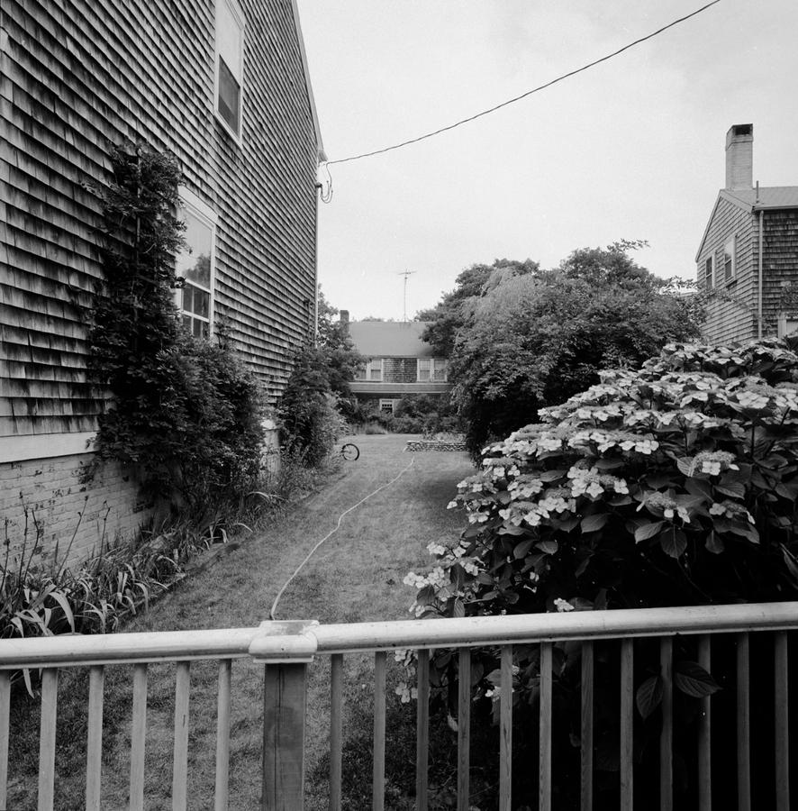
This one is a deliberate comparison to the first picture in the series with a fence pulling back in the frame. Here, the hose fills that position, seeming to be connected to the front fence although it is just because of where the picture is taken from that it looks attached. Also here the strong perspective of the house on the edge of the frame is on the left instead of the right. Finally, this is a much more open picture, with more sky that any of the others so far in the series. I read this as allowing us out more, or perhaps giving us a breather from the oppressive nature of the previous ones in the series which are predominantly closed in and contained. 

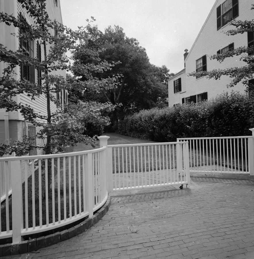
Clearly, in the way I took the previous one, this one and the next one, I am drawing attention to the nature of the fences, either as barriers to further progress or perhaps as gates through which one enters. This photograph does look as though it invites us in with the gate being partially open. But look towards the back. Is that a place you want to go back there where it gets darker? Notice how things are a little tilted or skewed in the picture. This is all a little unsettling. You go ahead back there if you like but I think I'll pass.

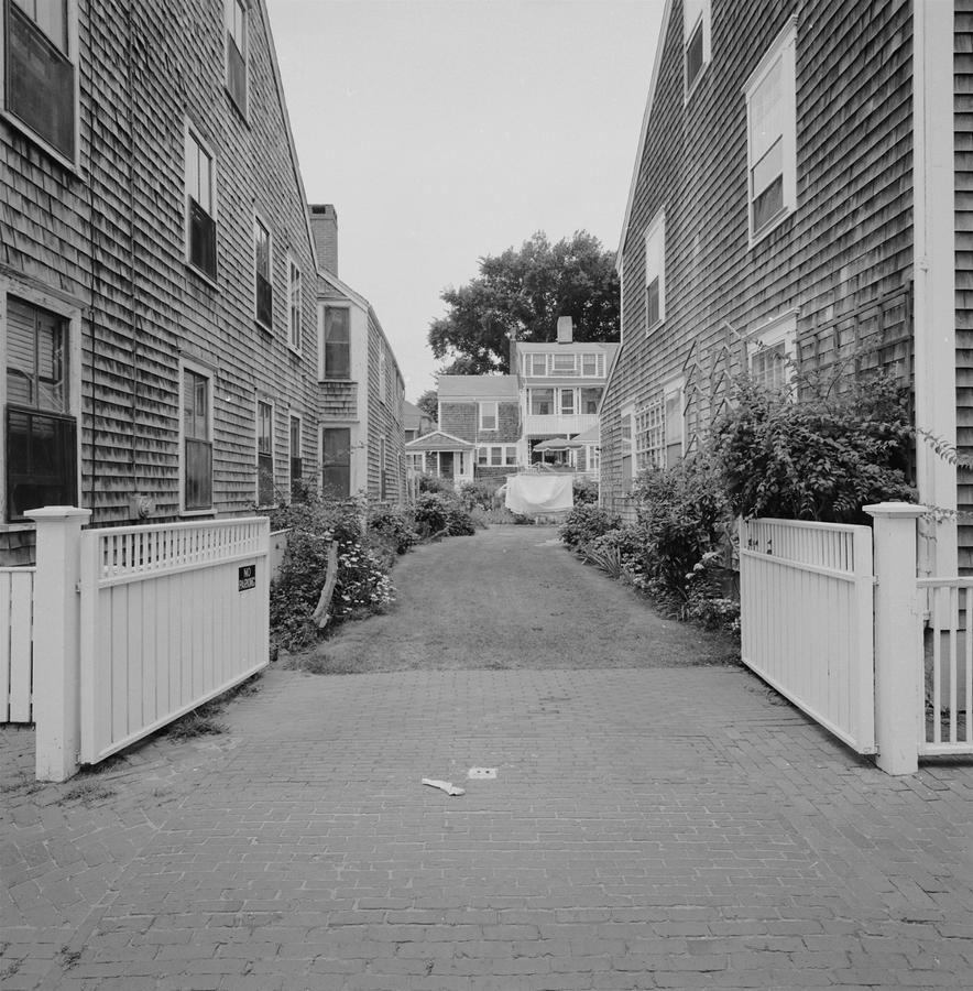
We're back here in the land of the light and this one even hints at activity and life. This is known among my friends and family as the "single sock picture" and makes a connection to laundry on the line, which is in back and to someone carrying it to hang on the line and dropping a sock along the way. The gate is wide open, inviting us to look back and through. This picture also mimics the structure of the darker gray one that is #3 in the series: two buildings, one on either side pulling back to form an alley. Lastly, look how light and open the image is. There are no dark shadows or mysteries here. 

So, here we are already, ending my analysis of the third part of the Nantucket series with the tenth picture in the set and it looks very conventional. 

Description: 

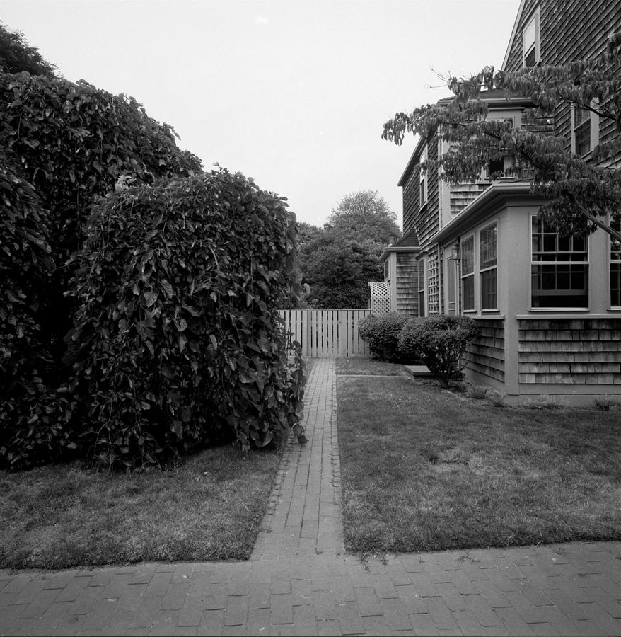
-A brick sidewalk off of which a walkway goes back to a fence with a gate.                  -Three prominent visual elements in the frame: part of a big dark bush, part of a gray shingle home and a light gray sky.

Okay, simple enough. And relatively straightforward as a single picture, living on its own with no context. Boring, right? Now think of this picture in relationship to the others in the series and see if you remember it in the sequence we've been looking at. Hopefully you've come to this: Bingo! Bam! Yes! How can something so benign and reductive have any meaning at all? Because I have altered the structural foundation of this picture into a new paradigm in comparison to the ones that preceded it. I've found a fence that spans the frame in the mid background and I am pointing the viewer to it using the brick walkway like an arrow. Why? For just that reason. To indicate and demonstrate that, while there is a conventional subject shown, I am interested in getting the viewer to see it in a new way, to think of this picture in the context of the others in a kind of flow, to ask the viewer to relate to the work by seeing both the reality being depicted here but to also acknowledge the manner in which I have worked to alter its meaning through pictures placed before it and after it. Hopefully, you now can understand why this series is placed so high on my "series meter" and why I believe it deserves this much scrutiny. 

Because it was the first where I made these realizations and connections.

Next up? Nantucket Part 4, of course.

Please know this: you may subscribe to this blog. That's the best way to get it as it will pop up on your in your "In Box" as soon as I post it. To subscribe, go to the blog and sign on in the column on the right where it says "subscribe". And yes, I will not write you any other emails or bother you in any way and yes, you may unsubscribe at any time.

Finally, feedback is welcome and appreciated. My email is: Neal

Topics: Black and White,Prints,Analog

Permalink | Posted February 4, 2014

Nantucket 1980 Part 2

This blog continues a description and analysis of a series of photographs I made in 1980 on the island of Nantucket in Massachusetts. If you are  just starting, I recommend you begin with Nantucket Part 1.

Here we go: There is something to the feeling you get when you know you are about to do really important work, but haven't done it yet. That's where we left off in the first part.

I knew I was about to make pictures that would be important to me in my career. We're talking of career forming pictures, seminal work that will be poked at and prodded by analysis later, forty years on, as the very foundation of my life's creative output. OMG! I know, once again, hyperbole rears its ugly head and runs amok, but seriously, this was big.

Onwards. We are now headed into the second phase of the series after looking at the first three pictures in Part 1. Very often in my work, there are subsets or, perhaps "chapters", that add up to a full series. We are starting now with the fourth picture in the group and it does just that, starts a new area of interest.

This picture diverges from the first three.

It's angle is very different, as it is taken as an oblique. It is also "straight" in that clearly the camera was held almost level in this one. By the way, the Hasselblad Superwide, being a fixed lens camera, had a 38 mm Biogon lens. This was very wide for the format and the camera was provided with a bubble level and a prism to see it with while you were looking through the viewfinder. Primitive by modern day standards but effective in allowing one to hand hold it and still get straight lines straight. I remember I sweated bullets on this print, wanting it dark but full in rendering the information on the negative. Behind the brick wall, the sun is trying to break through and spreads its light on the sidewalk. This was key to me. I used a chemical called potassium ferricyanide, which acts as a bleach, to lighten this one area. This was the same chemical W. Eugene Smith used famously in his Minimata series in 1972, published by Life Magazine:

(Please, I am not making a direct comparison from my work to this picture of a mother bathing her child who has been ravaged by chemical pollution on the island off of Japan called Minimata. This is one of the greatest photographs of all time. I am just using it as a way to show the effects of chemical bleaching.)

The next one was the darkest in the series:

and puts whatever content is in the picture in front of a large backdrop, as if this bush and tree were on a stage. We are right there, inside the picture, which is part of my point, to push the camera into the picture. Also, what happens at the point of intersection of the two clapboard walls on the right? Does the tree trunk do something there to the space? And finally, we have a large wall that serves as a backdrop to the foreground. But it also serves as a barrier to seeing anything beyond it. I focused the lens on the plant/bush on the lower left and the detail in there is like a whole world. I remember being pleased with the decision.

The third photograph in this subset, actually 6th in the series,

allows a little space to get out and is less closed in but draws us into a kind of conversation with the space. Look at what is going on with the top of the house towards the left side of the frame. The square format combined with the acute width of the lens allows us to be standing in front of something but also to see practically straight up too. This is in itself a lesson in perspective, convergence, divergence and is also pretty twisted if you really look at it. I was very interested in this characteristic, this "photographic seeing", at the time. By photographing something so mundane and ordinary and using the camera progressively, I could draw attention to this dichotomy. It is totally unique to be inside this space but seeing up as well as down without moving our head. This is photographic vision and one of the reasons I love photography. You too, probably, as you are reading this. 

In Nantucket 3 we will continue to seriously freak with reality as we work with the weird and wonderful world of the SWC camera with a lens designed by Carl Zeiss himself, who then brought it to the young Hasselblad company in Sweden in the mid 50's and said "here I've made this lens, care to match it with a camera?" Hence the camera I had nestled in my right hand as I walked around these bizarre back streets. 

Next up: Nantucket 3

Like I said: riveting

Topics: Black and White,Prints,Series,Analog

Permalink | Posted January 29, 2014