Portland, Maine 1996 Four
This is the fourth and last installment about the Portland, Maine pictures I made in 1996.
There are three more photographs in the series. Here is the next one:

With the numbers 35 and 33 this one makes me think about: serendipity, chance, similarities and differences, and, a recurring theme for me, the same but different. Serendipity as if you lived in No. 33 you'd be fortunate not to have this big hole in your front steps. Why is one side in worse condition than the other? "Similarities and differences" in this case is much like the "same but different" in that these two sides, these two apartments were made presumably exactly the same, with mirror image rooms and entrance doors. But time has modified them, individualized them, differentiated them. Look closely and you can see many differences. Decay and atrophy are persistent themes in my work, so it comes as no surprise to me that I was attracted to these crumbling concrete steps.
 And now for a change, the second to last photograph in the series. For the first time we are looking over a fence into a backyard, and one that is chaotic. There is still some containment and convergence too, notice the fence on the left and the steps on the right. There is also a filthy snow bank, lots of junk and a difficult path to the building in the mid background which is being threatened into obscurity by the tree branches. Imagine leaves on those trees in mid summer. They might block the house from view completely. What else? Rather than moving in close to eliminate the fence in the foreground I chose to leave it, with its sharp points looking like spikes that would gouge you if you tried to jump it.
 So here we are at the last picture in the series, this one showing real depth as we skim along several backyards. This is the first time we've seen a picture like this in the series. There are some obstructions to our release out of the picture, some junk in our way, but for the most part the path is easy. If you've looked at other series of mine you'll know that very often there is either an opening out to the rest of the world in the last picture or a barrier to that leaving. Take a look at the last image in Yountville, CA or Nantucket, MA as examples.
Here at at the end you might ask if there was some big point to these pictures, some conclusion to be drawn from the series that speaks to a more fundamental message. Another way to phrase this question is to ask if I went into it with a purpose in mind, a goal to achieve, some ulterior game plan perhaps to use these pictures to make a broad statement about something? Very simply, I did not. A series like this is an evolving process, made intensively over a short period of time and involving discoveries, trials, false starts, attempts and misdirections as well as successes. The Portland, Maine pictures do speak to the place, to where I photographed, to the light that was present those two days, to the time of year I made the pictures, to the issue of selectivity, how a photographer chooses to bring something to prominence, to photography and yes, to the width of the lens I used to make the pictures. But they do not dictate outcome, the viewer's interpretation of just what these pictures are about. This answer may irritate you, seem devious or that I am shirking my responsibilities as the person who made them. I don't believe I am.
Long ago, some years after I was finished with my graduate studies, I went to an opening at a gallery along Lansdowne Street in Boston, on the back side of Fenway Park, at a gallery called, if memory serves me, Enjay. The work was by Harry Callahan and, as he'd been a teacher of mine, I went to see the show and also him as I knew he was going to be there. Openings weren't Harry's favorite thing to do and I remember late in the evening, Harry leaning up against the counter in the back room while a drunk European man was verbally assaulting him with questions about what his work meant. He was standing right in front of Callahan and was screaming at him: "What's that mean?"he yelled, pointing at a picture of Harry's hanging on the wall and then, he pointed at another and yelled, "What's that mean?" By this time Harry had given up trying to reason with the guy. Although Harry could take care of himself, I went to his defense, pushing the man back away from Harry and yelling at him to leave Harry alone.
Forgive me, but I've never felt it was incumbent upon the artist to explain the work.
Before I close this post I wanted to touch on a couple of more points in regards to this group. One is result based coming from the conditions and circumstances I found myself in while making the Portland pictures. Were you to have the actual prints in front of you and were comparing earlier series to these and some series that follow this one you 'd notice right away, of course, I was working under brighter and contrastier light. If you know photography you know that alone usually makes for more depth of field, meaning I was able to use a hand holdable shutter speed with a smaller aperture. This is very apparent in the Portland pictures due to their being sharper from foreground to background.
The other point is that this was about to be an incredibly productive time for me. While I still continued to work in 8 x 10, that is a device that tends to produce pictures in a more measured manner and this was as true in the mid 90's as it had been for the previous ten years and also would be over the next ten. But having this Hasselblad SWC in my hand again, after a moratorium of many years, would also allow me to make many new pictures, series like the Oakesdale Cemetery series the following summer or the Hershey, PA series in the early spring of 1997. These, along with Portland, have proven to be seminal pieces in my oeuvre, shown frequently in various shows, some of which are in the 2006 monograph American Series. In fact, the Portland series are in the permanent collection of the Boston Atheneum and the Peddocks Island series is in the collection of the DeCordova Sculpture Park and Museum in Lincoln, MA.
And lastly, my printing by this time was well practiced and fulfilled a very clear set of objectives. The Portland series, while now shown as inkjet prints, were originally printed in the darkroom on Kodak 14 x 17 inch Polymax F surface paper and toned with selenium. The prints are about 12 inches square and printed in a very straight and undramatic way, meaning that they run from the D-max of a full black on up the scale to a Zone VIII and IX white while I made a clear effort to contain detail in both shadows and highlights.
If you're read through all four of these posts I thank you for hanging in with me. Sometimes these posts are a lot of work, but they also bring me back to where I was and what I was at the time I made a group of pictures. I am appreciative of both the opportunity to share them with you and also the challenge implicit in doing a good and thorough job.
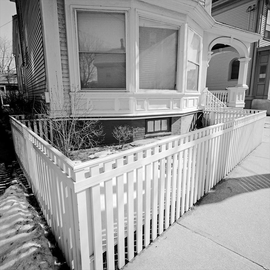 This one, with its white fence making a clear triangle, establishes another way in which I photograph. Pointing down with a wide angle lens makes a sort of "reverse convergence" in that the top of the frame bows out. In this case it ends up making quite a radical picture. Almost incidental but something we will see again soon, there is snow in the lower left. This places the photograph in the time of year it was made, late March. Also, I wanted to slide the viewer's eye to the right, up along the fence into the intricacy of the banister on the steps, then to the back railing on the porch and then to the boxed-in section of the side of the next door neighbor's house. And finally, on the opposite edge, there is a slight escape out of the frame to the sky behind that is rendered a middle gray, sliding down the clapboards on the side of the house that never looked like that in reality.
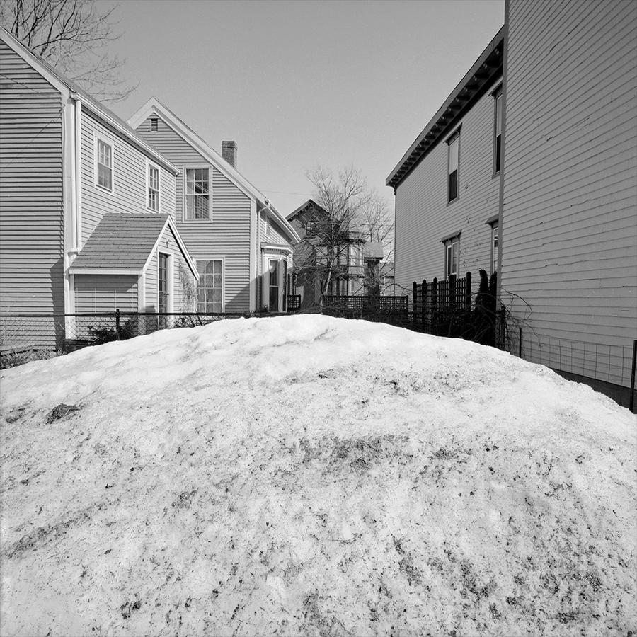 Here's much more snow, in the next photograph. Why? I liked being able to use the snow mound here, although this in no way is a core picture. It is simply an unusual and different form than I would normally have to work with so I used it. If I break down these two and the next one it is clear I was interested in depth, not so much parallel plane pictures in these three.
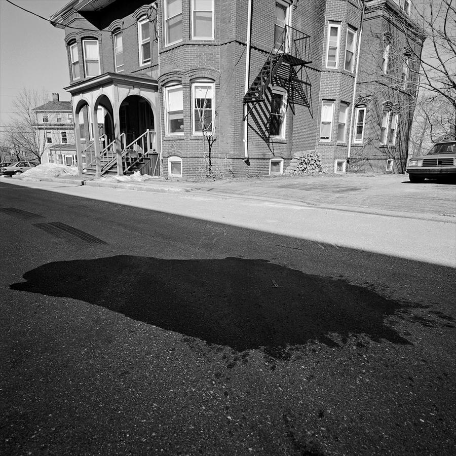 In this group of three, this is the last and reaffirms the previous triangle picture at the start with the white fence, in a reverse priority of placement, putting the shadow in the foreground to accentuate the building and its new rendition, never intended by any archtitect, however long ago. I am using the lens to convey the building here as a caricature of itself. The dark form on the pavement inside the large shadow speaks to something a little more ominous or foreboding, at least to me. It's difficult not to think of it as some big stain and blood looks black in black and white photography. It's actually a patched repair in the street. I have, once again, as I did in the first photograph, used vehicles to edge the photograph on the left and right. This is a tactic to contain the picture, to end it definitively rather thean just let the picture slide off at the edges. But also they are there as a kind of visual aid, as we know how big cars are and they are ubiquitous in our present day world. I like how large the one on the right is and how very small the one on the left. This is that wide angle lens doing its thing again.
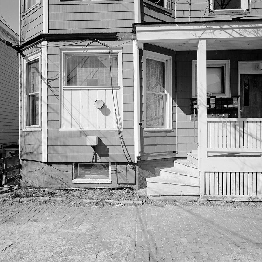
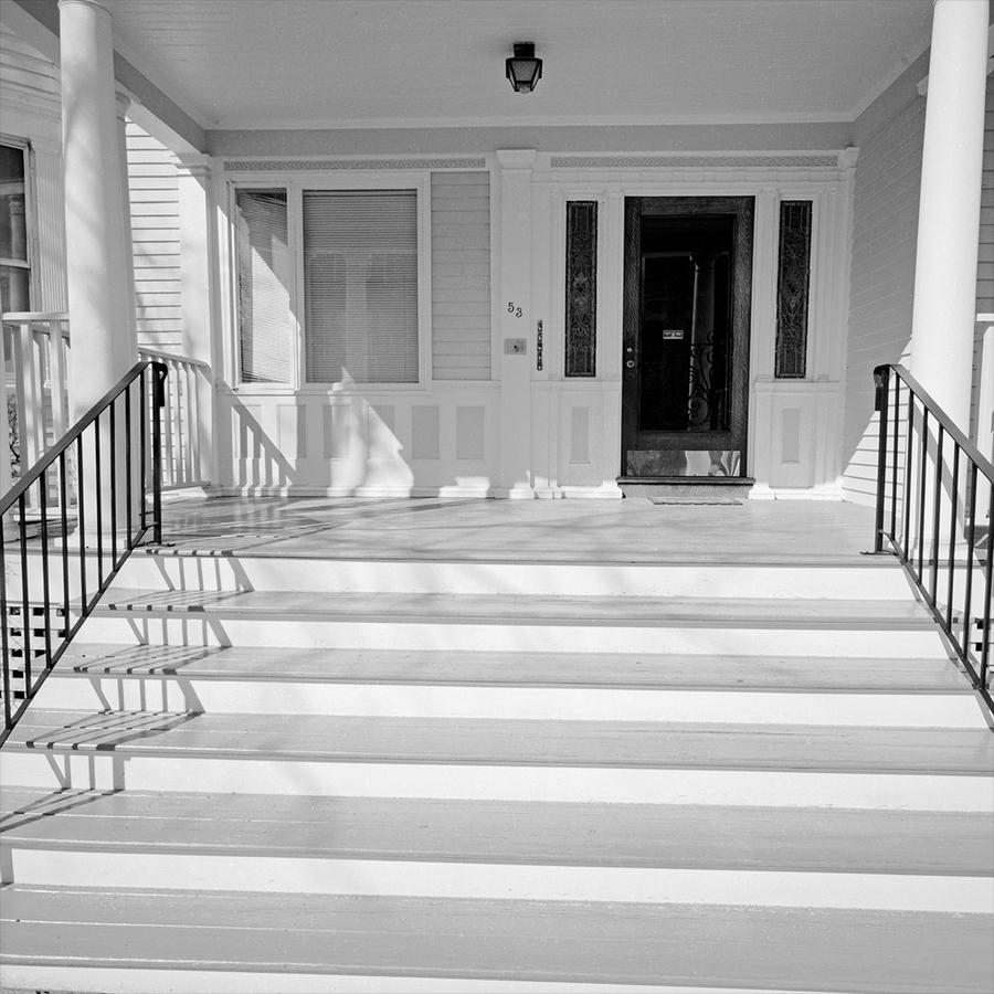 This picture brings us back to rough planality (don't know if this is a word. Planalness maybe? The characteristic of the camera being in the same plane as the subject). We are also brought back to the sheer quantity and brilliance of light present that day. There's a little ambiguity too about doorways here. The entrance appears to have been to a duplex of some sort in a former life, with what had been another door now being replaced by a window on the left. We will get to another somewhat enigmatic doorway again in a few more pictures.
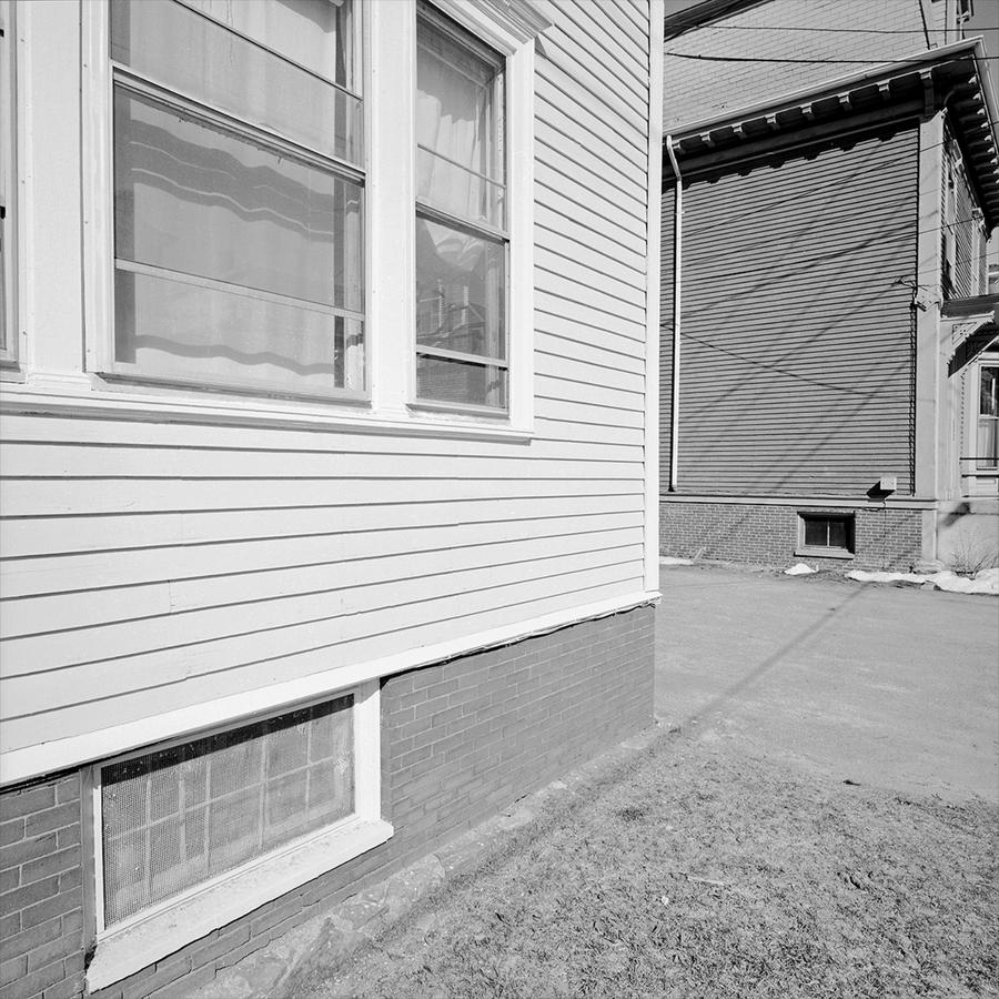 This is a core picture in the series. A road to nowhere? A pathway to a wall? Forgive me, but this was just really fun, to be able to do this. Shooting this way, walking along a street in a city or a town is a challenge in answering the question: "what else can you do?" In order for this to work in the context of being able to line this up, to slide the picture from foreground left to background right, to contain it so, to keep the camera level, to print it tonally light and mostly flat was simply a rarity and a pleasure. How something so modest looking can be such a simple and complex thing at the same time, with its shadow lines of the wires criss crossing the picture like a dance, is simply one of the reasons I keep photographing. I regard this picture as a gift.
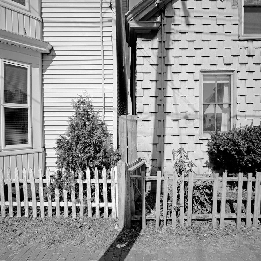 Flat, planal and deceptively simple looking. Two buildings pressed close together but not necessarily getting along too well. Some serious work done to keep them separated from each other too. Different taste as well, one grounded in tradition and one not. But also on the left things are kept up far better. The big slash of a shadow from the telephone pole right over my left shoulder reinforces all this.
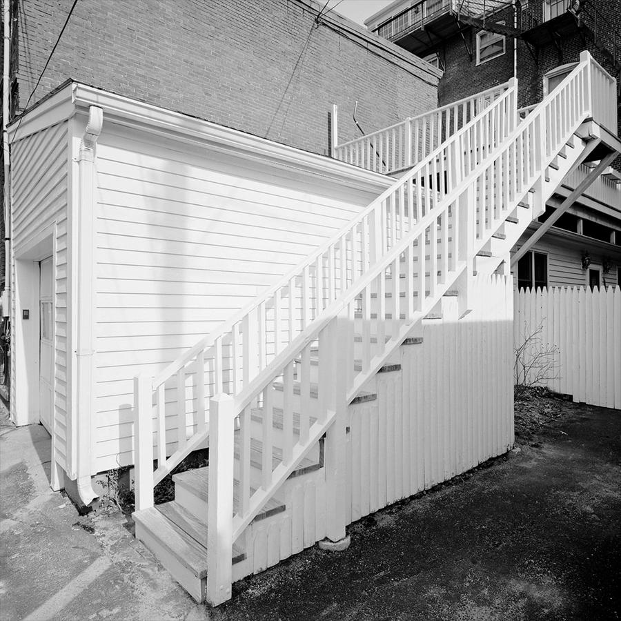 As you may have been able to tell we're in the substantive center of the series here, with each picture having real weight, perhaps being referenced by something that came before it, as this one is, but making its own statement as well. Clearly this stairway refers back to the other fence picture but I've worked to keep the camera level which limits convergence more. Have you ever seen stairs go higher or be bathed in more gorgeous light than this? The stairs lead from shadow to light and I feel lighter as I climb up them. Then there is the simple rectangular box of the garage. Not so simple, actually, as the lines formed by the edges of the clapboards are zinging all over the place, shooting at us, several going over my right shoulder like laser beams. Can you tell if I love this picture? I do and am proud of being its author. But I would categorize this picture as a success mostly due to being aware of its inherent possibilities and being in the right place at the right time. Very few photographers know how to use a wide angle lens well and the lenses are often referred to as being "for experts only" as if handled badly or haphazardly, the results can be a disaster. I know, I've made my fair share. But this one works for me. Why did I place this one next to the one preceding it? Because the first is flat and this one is about depth and distance. Also the shadow from a telephone pole is repeated here, used again, although less emphatically, to allude to things going on outside the frame. Finally, I regard this picture as a study in perspective.
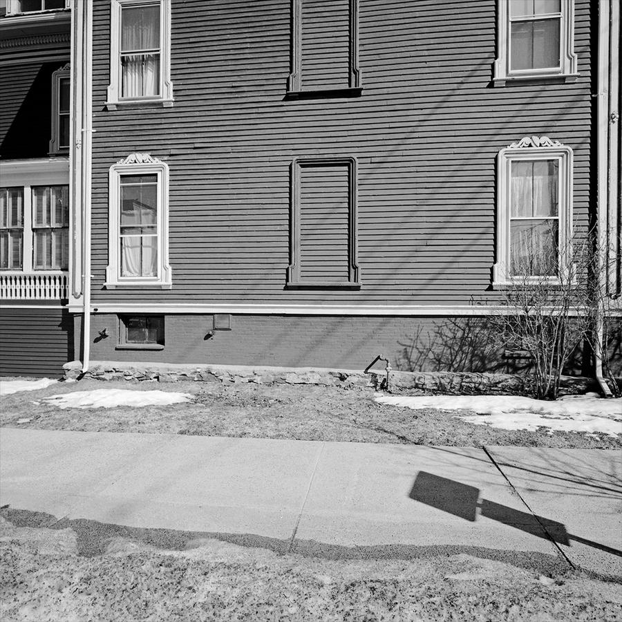 Were these stacked prints in a portfolio we'd know the stack is getting smaller by the time we get to this picture and so I am going to close this section after this image but want to draw attention to a few things about it.
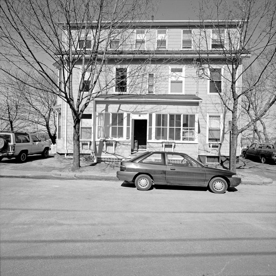 Because it can. This is straight out and flat out an affront on the viewer's eyes. A symphonic blast from the brass instruments proclaiming that this is different, new and brash. A slap in the face saying "wake up". Bright and glowing but contained by the perimeters of the trucks both left and right and further by the car in the front as well as the telephone wire shadows, the picture is my way of saying that I am working in a new way. It is frontal, confrontational and loud.
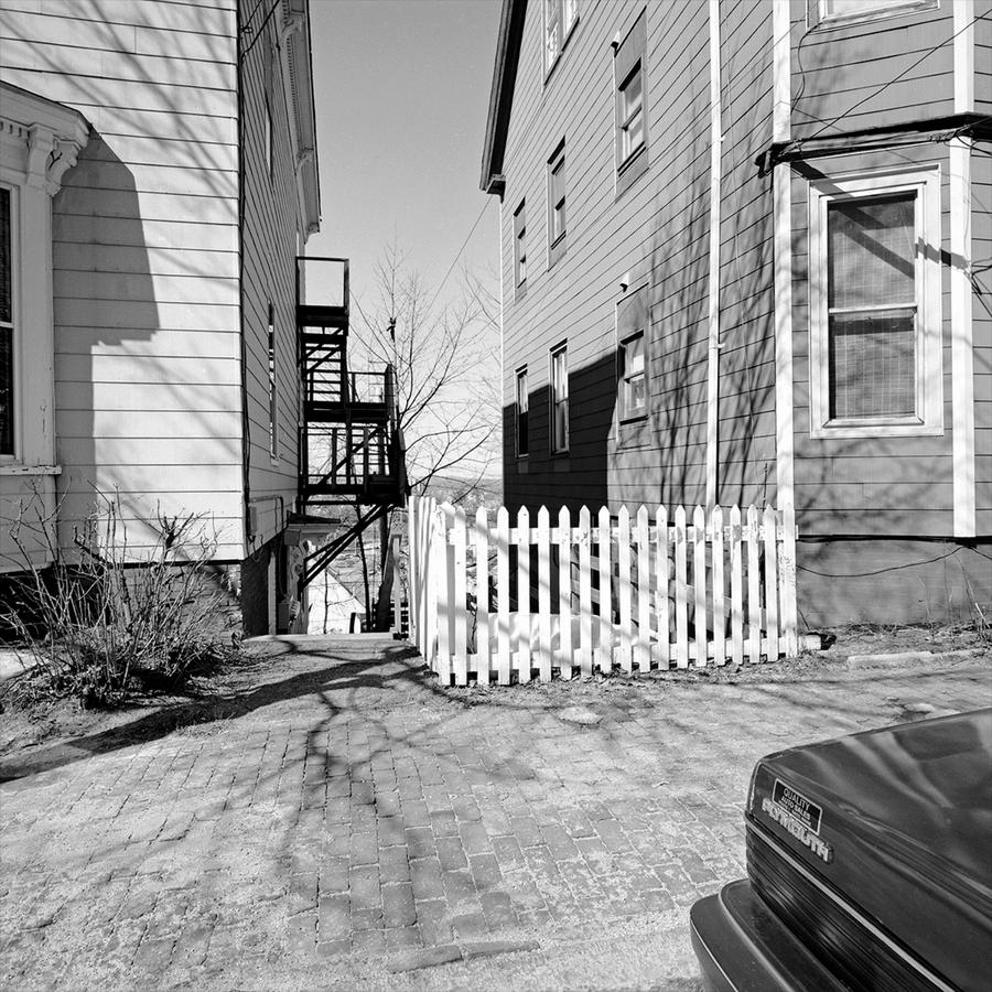
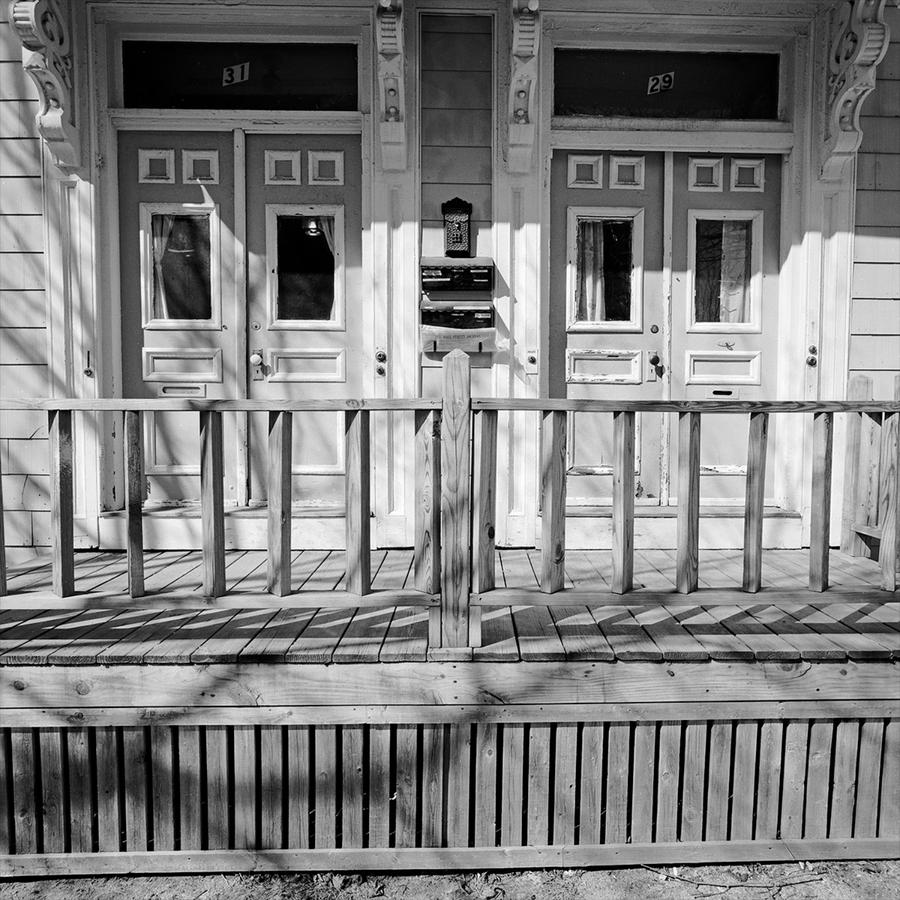 I wrote about this one in the first Portland post, but suffice it to say that it grounds the two others in the group in a complex and intricate way of looking. It is also planal in that the subject sits roughly parallel to the camera. This is important, as you will see.